Hi, this blog has been upgraded, but I'm leaving the old pages online until the search engines catch up. If you want to join the discussion, this may be the page you're looking for on the new site.
Day 3.5 - Site redesign
How much fun we have working on the site...
This is the last design stage. After this, the front page should start looking like something.
Tonight, I took all of the planning information -- stuff that I wanted to include in the site, or things that I didn't like about the existing design, and sat down with a pencil and paper. Sure, I coulda done the same work on the 'puter, but my eyeballs decided that they didn't really want to look at the monitor.
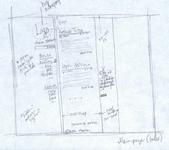
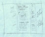
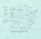
The important thing is... that I was able to put my ideas down, and they didn't scare me all that much. Some of them seem to even make sense. Take a look at the scans, then go back, and look at the swatches, and enjoy.
Now that I have a pretty good idea where I am going, I am going to start the implementing the design tomorrow. There are still a number of areas that I don't have a handle on. There are also a bunch of new ideas and changes that will be made along the way.
There are three different scans below. The first is the main 'index' page of the site. The second shows the individual article page (like this one that you're reading now). The third image is just some more detailed info on some of the details.


# # #
read comments
Hi, this blog has been upgraded, but I'm leaving the old pages online until the search engines catch up. If you want to join the discussion, this may be the page you're looking for on the new site.
Hi Sissy --- I mean, random web visitor...
You are right -- when in the article page, the thumbnails will be in the third column. My hope is to have them open in a new layer on top of the article, instead of in a new page. Then, when someone is done looking at the picture, they click a close button (or something) and they're returned to their location in the article. I hope that it will make the interaction a little more intuitive than opening a full size image in a new window, or making the user click the back button after looking at the pic.
And yes, I am still using MT 2.64. I want to move up to a new version, but I find that it's best not to mix projects. One of the low level goals of this project is to reduce my dependence on MT plugins (such as the netflix queue). That will make it easier to upgrade.
I'm kinda stuck with MT due to database issues (namely, no MySQL). A couple of years ago, my web host was looking to raise a little cash (i guess) and offered an "eternal" account. I paid a couple hundred bucks, and now pay only $25/year. Until I can beat the price, I'm not gonna move hosts.


Some really good design ideas here, and I look forward to seeing the implementation.
Questions: So it appears that you plan to have images appear in the third "column". Are these thumbnails? If so, how will they behave when clicked? Their own new window? You don't think you will have need for imbedded images? Are you still running with Movable Type as your CMS?
-R