Hi, this blog has been upgraded, but I'm leaving the old pages online until the search engines catch up. If you want to join the discussion, this may be the page you're looking for on the new site.
Screen Screen Printing Part 2: the design
Im sitting around at home, hopped up on painkillers from a mouth-based melee at my dentist's office. What better time to get caught up on my articles?
Part 2 of this series provides tips and tricks that I use when creating designs for silk screening. Well worry about how to transfer the design to the screen in the next article.
Did you miss Part 1 and want to learn how to build a screen? Or perhaps just want to relive the fond memories by reading it again? Click here for Silk Screen Printing Part 1: Making a Screen.
One additional note: This is stuff that we figured out through trial and error, books from the 70s, and some scant info that we found online. We are not professional screen printers, just folks sharing what worked for us. Your mileage may vary.
Heres a list of the ingredients that you will need to play along with me today:
- A great idea
- Computer with a printer
- Photo editing software
- Overhead transparency paper
initial thoughts
Screen printed art has a unique look, and it looks way better than an iron-on. Another added bonus is that the screened design will last years longer. There are also some limitations that you should be aware of.
When you create your design, you should keep in mind what makes the screen technique special, and work it into your design. So, heres a short list:
- Your design will have a limited number of colors. Each color that you want to include in your design has to be printed separately. Each additional color adds a layer of complexity and more risk of goofing up.
- Due to the limited color palette, your design will be very strong and iconic without actually doing too much. Make this work for you.
- All design rules apply. Take your time and develop a great idea. A mediocre design is still mediocre even when its emblazened on 50 shirts. Ive been guilty rushing the design just so that I can get to the fun part. Now, I try to work on a design for a few hours, then come back to it a couple of days later, to see if there are any other little bits that need to be tweaked or adjusted.
- The size of your design is limited to the size of your screen. (Actually a little smaller, to allow room on the screen for the ink and squeegee.)
creating your design
I will generally have a quick sketch or idea forming in my head before I sit down in front of my trusty computer. It's much easier to start if you have an idea.
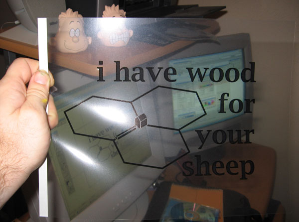
The end result is going to be a positive design of black ink printed onto a transparency. I generally design in black and white so that I'm not distracted by the colors. If I am working on screen that will use multiple colors, I might play with the colors a little during the design, but everything that I print out will be black.
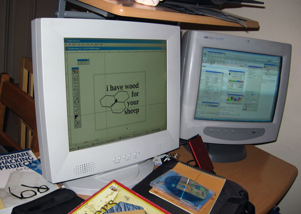
You can create a design in almost any graphics program. I prefer Adobe Photoshop or Illustrator. If you know how to use Photoshop, but are looking for a less-pricy free version, I highly recommend GIMPshop, an open source photo editing software. The controls are similar to Photoshop, and Gimpshop plays well with Macs and PCs.
The process is easier to show than describe. Each design that you create will be different, but the link below outlines a few of the basic steps that I use when making a screen from an existing image. (Its a little Flash-based tutorial that I made using Wink -- also free software.)
Click here for the quicky tutorial (pops).
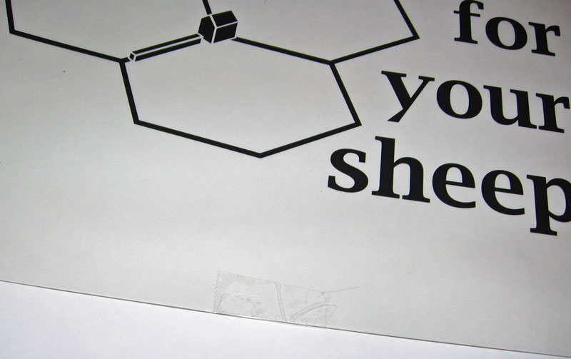
Once you have the graphic designed print two copies of the image onto the transparency paper. Carefully line up the two copies and tape the edges, so that you end up with one super dark print.
Note: When you go to the store to buy the transparencies, read the package carefully; they come in a couple of flavors including one type for laser printers and one for ink jet printers. Know thy printer type before hitting the office supply store (Most home printers are of the ink jet variety.)
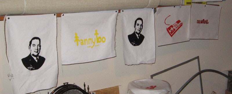
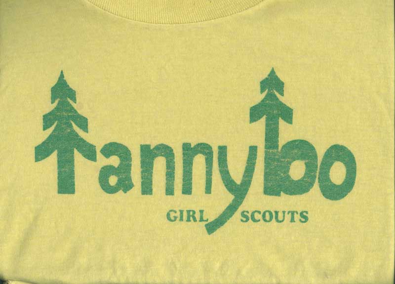
That's really about it. Practice. Notice what kinds of shirts, designs, and logos that you like, and keep working on your own designs. If any of this discussion seems fuzzy, check out the gallery on the right for additional explanations and photos.
In Part 3, Ill walk you through burning the image from the transparency onto your screen.
resources
Here's a couple of resources that you can use to get started.
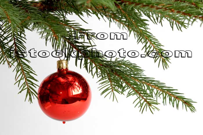
istockphoto-is a good resource for stock photos. You can find almost anything on this site, and I've used a number of photos from this site as a starter for designs.Stencil Revolution-check out the stencil galleries for ideas on how to develop images with a limited palette.
# # #
read comments
Hi, this blog has been upgraded, but I'm leaving the old pages online until the search engines catch up. If you want to join the discussion, this may be the page you're looking for on the new site.


Great tutorial, Matty! Hope your mouth feels better soon, too (btw, "mouth-based melee" totally cracked me up)